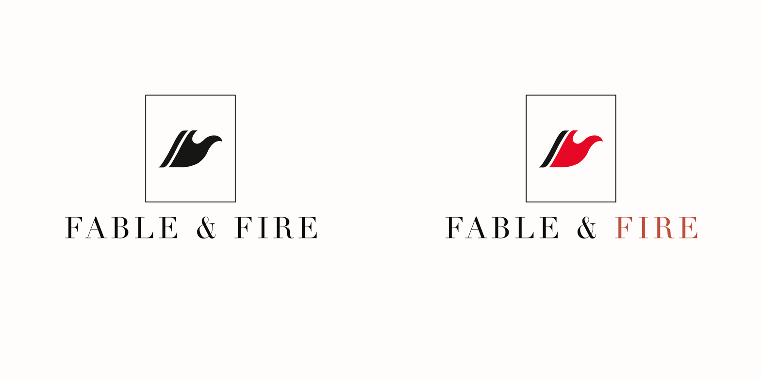
fable & fire logo rebranding
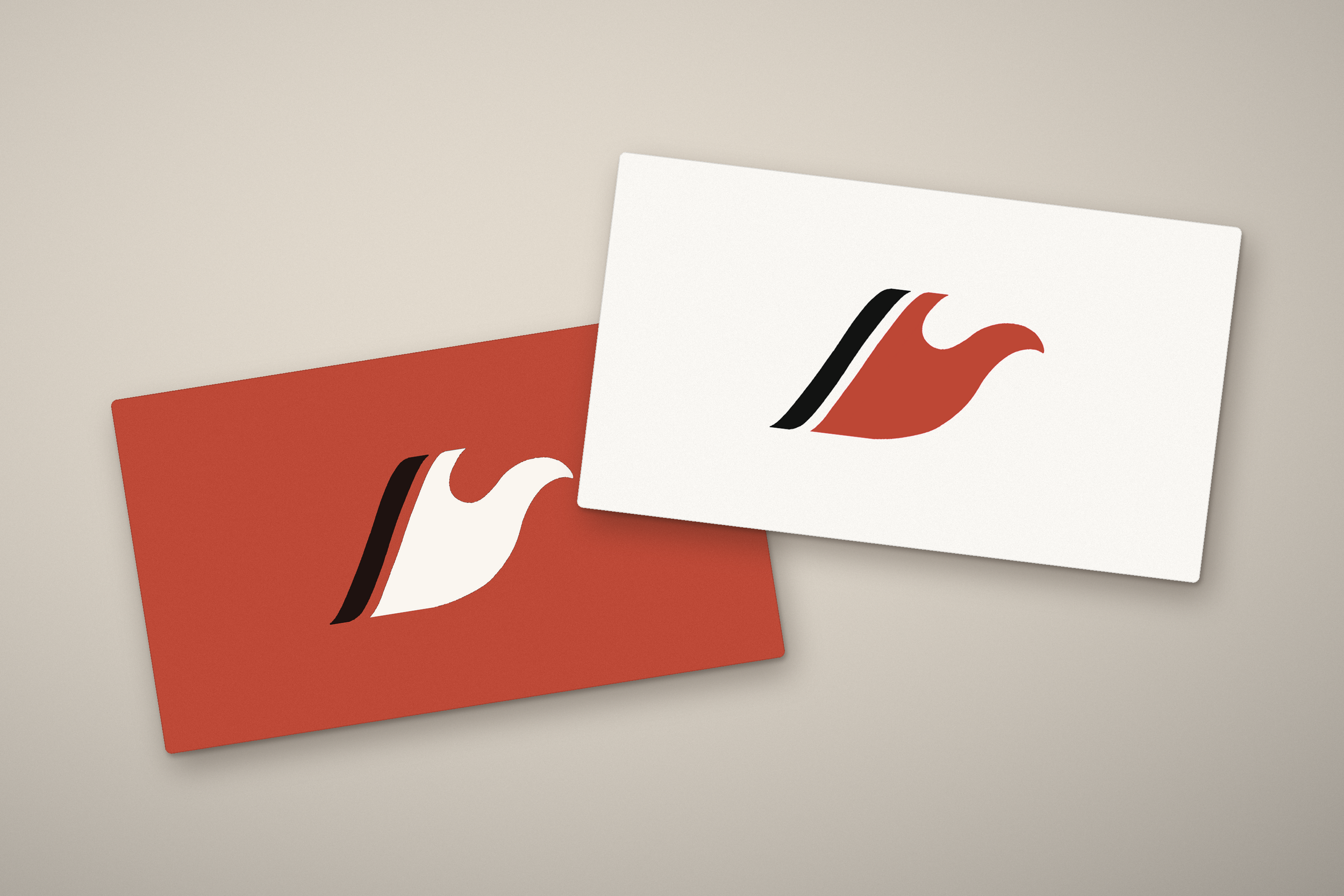
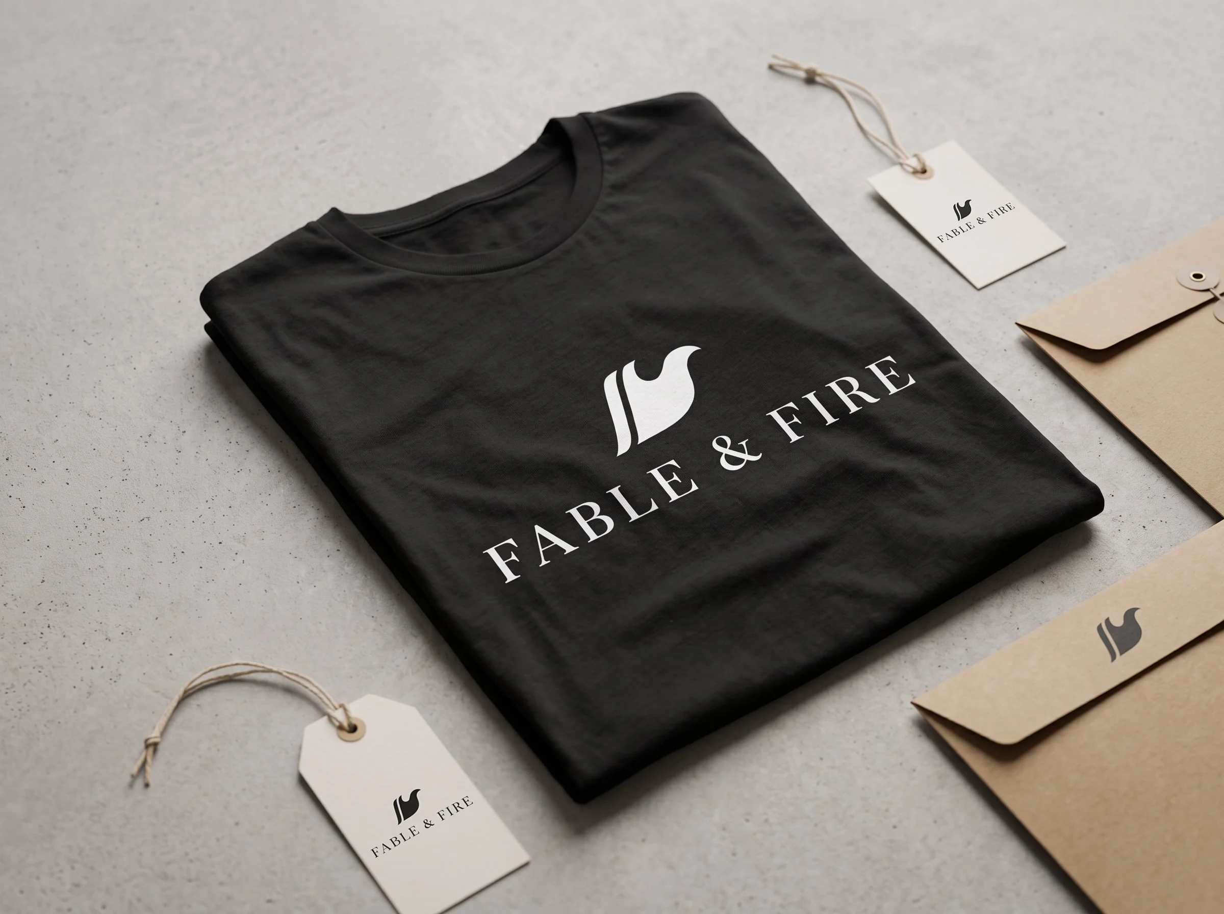
This rebrand simplifies the store’s logo into a bolder, more memorable mark. Applied across promotional materials and merchandise, it is designed to draw in new customers and strengthen brand recognition.
Approach:
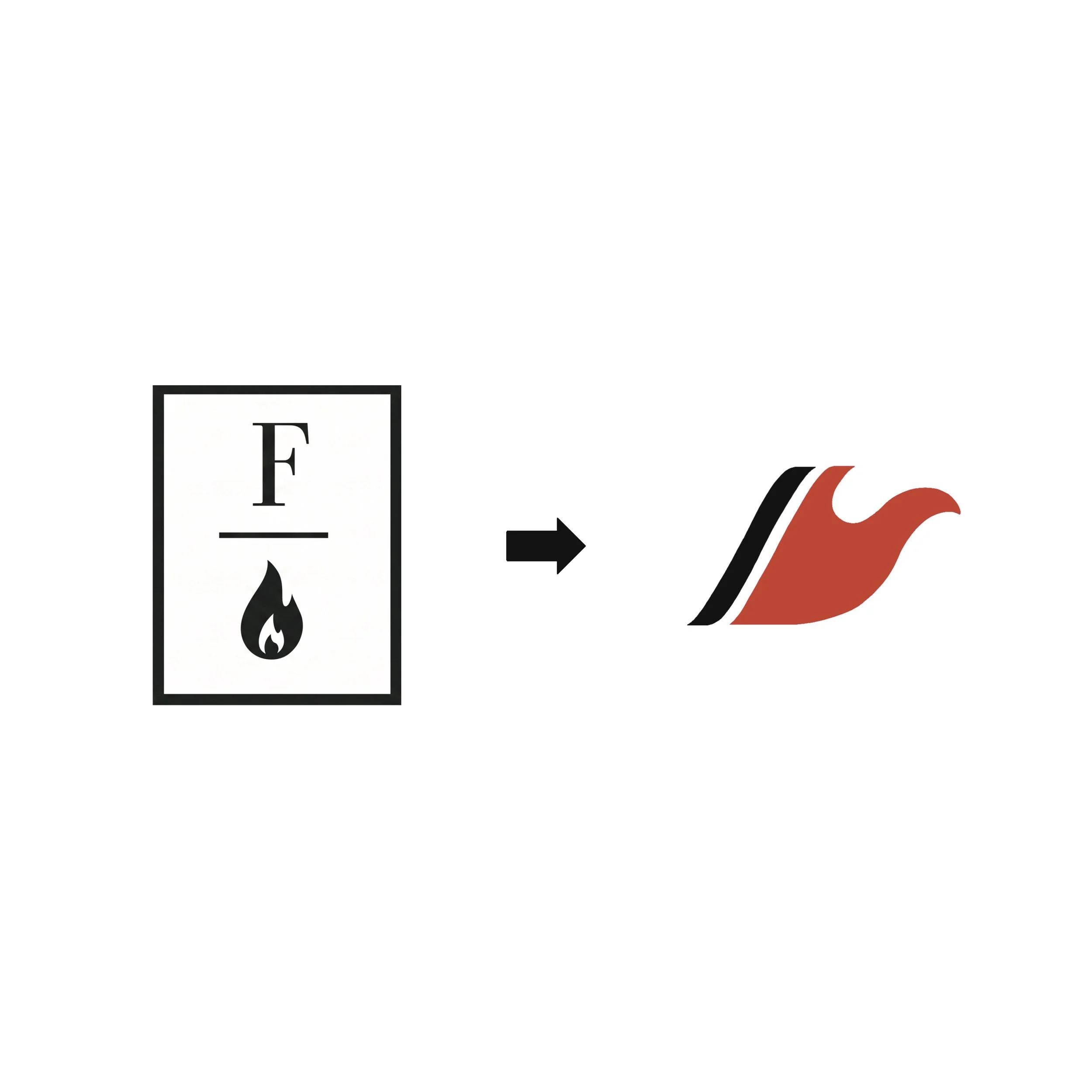
Fable alludes to fantasy and fiction in which cursive and italic typography represent well. By simplifying the “F” into a minimalistic form and creating a copy with a more flame-like shape I was able to bring a more eye-catching logo to the audience.